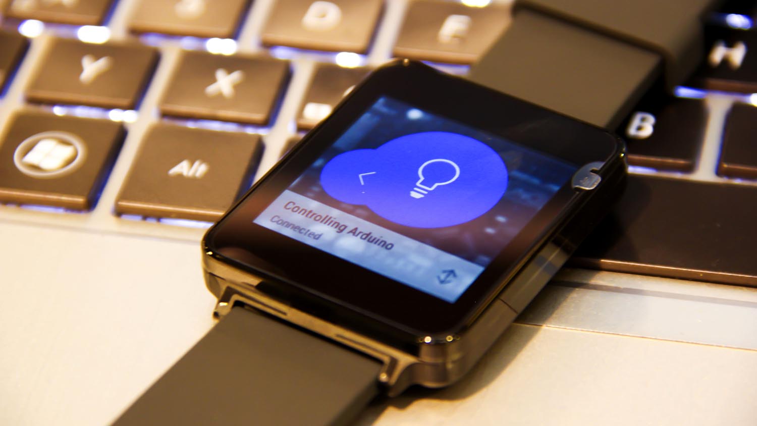
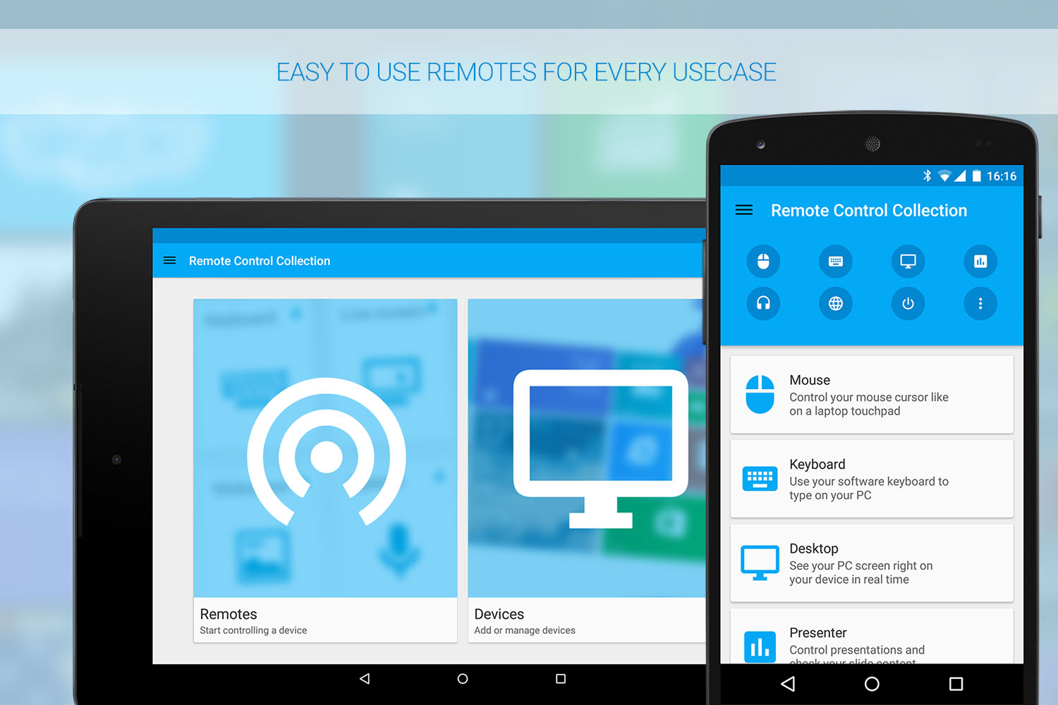
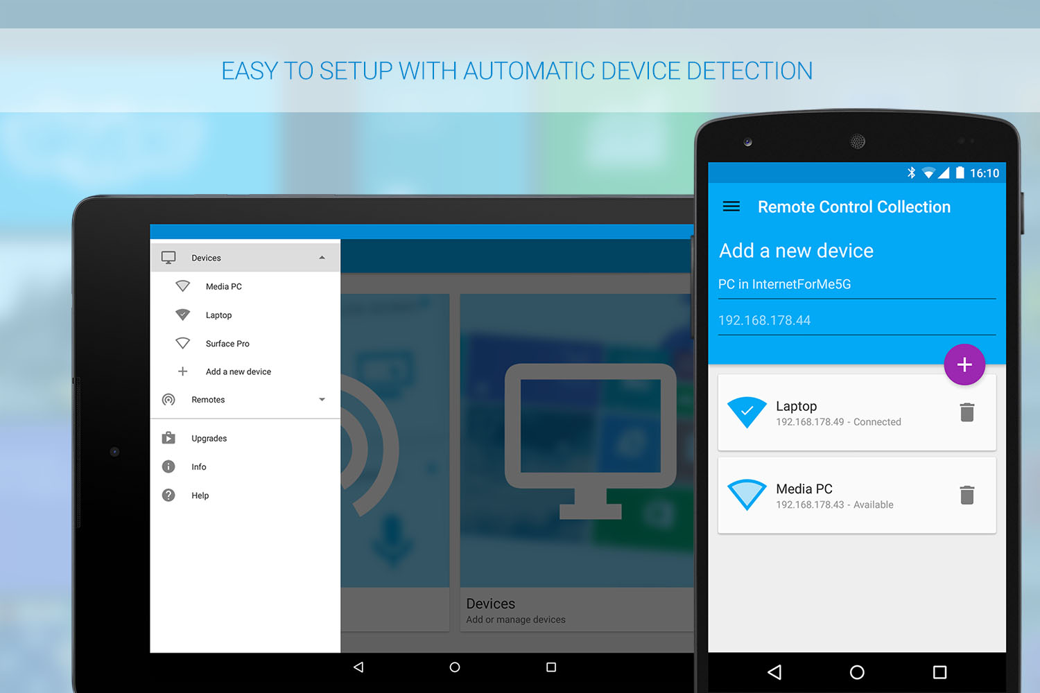
One of the things that make Android L awesome is the new Material Design. Of course the Remote Control Collection won’t miss out following new design guidelines – so I created the app from scratch and made sure it would fit well into the new Android environment.
New UX
I’ve completely redesigned the whole experience, not only the UI. Keeping the Google guidelines and lectures from my recent Human Computer Interaction class in mind, I changed the way users would need to interact with the app. For the first time ever, I took advantage of usability testing and used the feedback from communities, highly engaged users and testers to build an app that maintains it’s complex functionality while being super intuitive to use.
|
|
Comparison Over Time
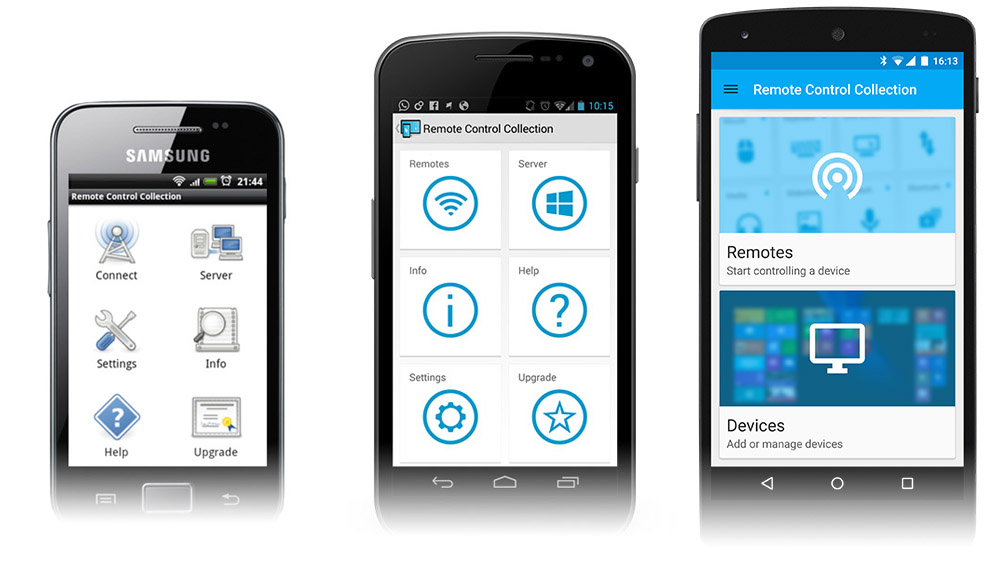
Taking a look back to the first release of the app, which was in late 2012, the UI has changed quite a bit. Here’s a comparison of version 1.3 (Gingerbread), version 2.2 (ICS, Holo design) and version 3.2 (L, Material design).
